Data Visualization Tools
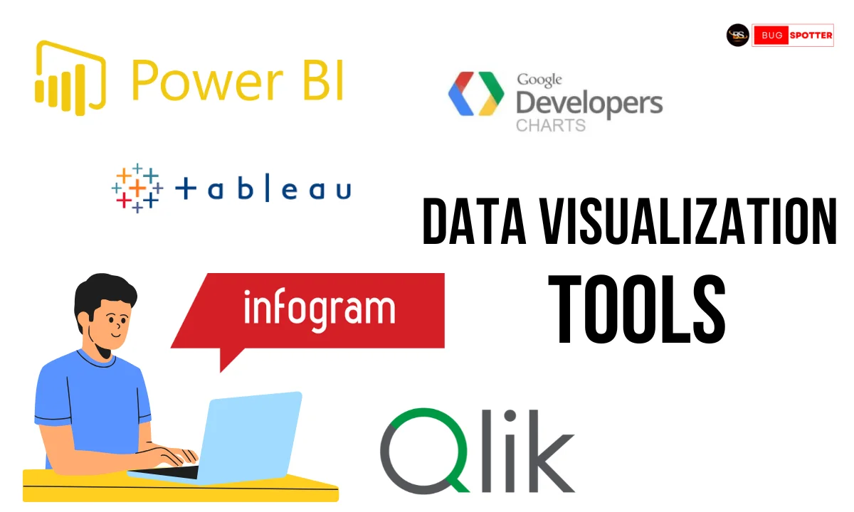
Data Visualization Tools
Introduction
In today’s data-driven world, raw data alone is not enough to uncover insights or tell compelling stories. The true power of data lies in its ability to be visualized, making patterns, trends, and outliers easier to spot. Whether you’re a data analyst, business leader, or marketer, understanding the importance of data visualization tools is essential to turning complex datasets into actionable information. In this blog, we’ll explore the significance of data visualization and the top tools available to help you create stunning, insightful visualizations.
Why Data Visualization Matters
Before we dive into the tools, let’s first understand why data visualization is so important:
Simplifies Complex Data: Data visualizations transform complex, raw data into understandable and actionable insights, making it easier for users to digest large amounts of information at a glance.
Enhances Decision Making: By presenting data visually, decision-makers can quickly identify trends, outliers, and relationships in the data, which supports more informed choices.
Improves Communication: A well-designed chart or graph can communicate key findings far more effectively than raw tables of numbers. It’s an ideal way to present information to audiences with varying levels of data literacy.
Highlights Patterns and Trends: Visual representations, such as charts or heatmaps, allow users to spot patterns or trends that may not be immediately evident in raw data.
Top Data Visualization Tools
Now that we’ve covered the importance of data visualization, let’s explore some of the leading tools that can help you bring your data to life.
1. Tableau
Overview: Tableau is one of the most popular and powerful data visualization tools on the market. It offers a wide range of features and integrations that make it suitable for both beginners and advanced users. Tableau allows users to connect to multiple data sources, create interactive dashboards, and visualize data with a variety of charts, maps, and graphs.
Features:
- Drag-and-Drop Interface: Allows users to create visualizations quickly, without the need for coding.
- Interactive Dashboards: Offers a wide range of interactive elements such as filters and drill-down capabilities.
- Data Connectivity: Integrates with numerous data sources, including spreadsheets, databases, cloud services, and more.
Best For: Businesses and professionals who need advanced and highly interactive data visualizations.
2. Power BI
Overview: Developed by Microsoft, Power BI is another top-tier tool for creating impactful visualizations. It seamlessly integrates with other Microsoft products, such as Excel and Azure, making it ideal for organizations that already use the Microsoft ecosystem.
Features:
- Custom Visualizations: Users can create custom visualizations using Power BI’s wide variety of templates or integrate third-party visualizations.
- Real-Time Dashboards: With Power BI, you can create dashboards that update in real-time, helping you stay on top of the data as it changes.
- Ease of Use: Designed for ease of use with a familiar interface for Microsoft Excel users.
Best For: Businesses already using Microsoft tools looking for an easy-to-use solution with powerful capabilities.
3. Google Data Studio
Overview: Google Data Studio is a free, web-based tool that allows users to transform their data into customizable and shareable reports. It integrates seamlessly with other Google services, such as Google Analytics, Google Sheets, and BigQuery.
Features:
- Collaboration: Real-time collaboration allows teams to work together on the same report.
- Google Ecosystem Integration: Smooth integration with Google Analytics, Google Ads, and other Google tools.
- User-Friendly: Simple drag-and-drop interface, perfect for beginners.
Best For: Small businesses and individuals who need a free and straightforward tool for data visualization, especially for marketing analytics.
4. Qlik Sense
Overview: Qlik Sense is an end-to-end data analytics and business intelligence platform that focuses on guided analytics and visual exploration. It allows users to explore data freely and is known for its associative model, which enables users to uncover hidden insights across their data sets.
Features:
- Associative Data Model: Offers powerful search capabilities and enables data discovery through its unique associative model.
- Smart Search: Allows users to search and explore data with natural language queries.
- Self-Service and Governed Data: Combines self-service visualization with centralized governance, ensuring that everyone in the organization can create their own insights while maintaining data integrity.
Best For: Enterprises that require high-level, interactive visualizations and data discovery.
5. D3.js
Overview: For users who prefer to code their own visualizations, D3.js is a JavaScript library that provides great flexibility. It enables developers to create complex and dynamic visualizations directly in the browser.
Features:
- Customizable: Offers complete control over every aspect of the visualization.
- Dynamic Data Handling: Excellent at handling large datasets with real-time updates.
- Wide Range of Visualizations: Supports various chart types, including hierarchical visualizations and geographic maps.
Best For: Developers who need complete flexibility and control over the visualizations they create.
6. Plotly
Overview: Plotly is a versatile tool for creating interactive plots and dashboards. It’s well-suited for users who want to create high-quality visuals for their data but don’t have extensive coding knowledge.
Features:
- Ease of Use: A simple, drag-and-drop interface for creating visuals without needing to write complex code.
- Highly Interactive: Visualizations can be zoomed, panned, and explored interactively.
- Wide Integration: Integrates well with Python, R, and other analytics tools.
Best For: Data scientists and analysts looking for interactive, publication-quality graphs and charts.
7. Sisense
Overview: Sisense is a comprehensive business intelligence tool that combines data integration, analysis, and visualization. It is known for its ability to work with large datasets and provide powerful analytics capabilities.
Features:
- Data Integration: Can handle complex data integration from multiple sources.
- Embedded Analytics: Allows businesses to embed visualizations into their own applications or websites.
- Advanced Analytics: Offers capabilities like predictive analytics and machine learning integration.
Best For: Large businesses or enterprises needing advanced analytics and seamless data integration.
8. Zoho Analytics
Overview: Zoho Analytics is a business intelligence tool that provides easy-to-use features for data analysis and visualization. It offers an intuitive drag-and-drop interface and is especially popular among small to medium-sized businesses due to its affordable pricing and integration capabilities.
Features:
- Pre-Built Templates: Comes with a wide range of pre-built reports and dashboards to get started quickly.
- Collaboration: Allows team collaboration with shared dashboards, data, and reports.
- Data Integration: Integrates with popular tools like Google Analytics, QuickBooks, and Salesforce.
Best For: Small to medium-sized businesses looking for an affordable and easy-to-use BI tool.
9. Microsoft Excel (Power Query & Power Pivot)
Overview: Excel remains one of the most widely used tools for data analysis, and with the addition of Power Query and Power Pivot, it has become a powerful data visualization platform. While Excel itself is not strictly a data visualization tool, its built-in features allow users to create sophisticated charts, graphs, and pivot tables with ease.
Features:
- Pivot Tables and Charts: Advanced features for summarizing and visualizing data in many different formats.
- Power Query: A tool for importing and transforming data before visualizing it.
- Power Pivot: Lets users work with large datasets and perform complex calculations and data modeling.
Best For: Users who are already familiar with Excel and want to enhance their data visualization capabilities without using a separate tool.
10. Looker (now part of Google Cloud)
Overview: Looker is a business intelligence tool designed to help organizations visualize and analyze data. It offers a powerful data exploration interface and integrates well with big data solutions and Google Cloud services.
Features:
- Data Exploration: Users can explore data in an interactive and user-friendly manner without needing to write complex SQL queries.
- Custom Dashboards: Allows the creation of customized dashboards to visualize key business metrics.
- Data Modeling: Looker’s unique data modeling layer allows users to create reusable and consistent definitions across reports.
Best For: Medium to large enterprises needing a robust platform for data analytics and visualization.
11. RawGraphs
Overview: RawGraphs is an open-source data visualization tool that allows you to create a wide range of visualizations from raw data. It’s particularly useful for designers and those looking for more creative freedom in visualizing their data.
Features:
- Customization: Offers a highly customizable interface and a variety of chart types, including complex visualizations like network graphs and Sankey diagrams.
- Open Source: As an open-source tool, it’s free to use and flexible for a variety of applications.
- Export Options: Visualizations can be exported as vector files (SVG) for use in design software.
Best For: Designers and developers who want full control over the appearance and layout of their visualizations.
12. Infogram
Overview: Infogram is a web-based tool that helps users create interactive infographics, reports, and data visualizations. It’s known for its user-friendly interface and wide variety of templates.
Features:
- Templates: Infogram offers a wide range of templates that are easy to customize.
- Interactive Elements: You can add interactivity, including clickable elements and embedded charts, for richer user engagement.
- Real-Time Data Integration: It integrates with Google Sheets, Excel, and other data sources to update visualizations in real-time.
Best For: Marketers and content creators who need visually appealing and interactive infographics.
Latest Posts
- All Posts
- Software Testing
- Uncategorized


Categories
- Artificial Intelligence (5)
- Best IT Training Institute Pune (9)
- Cloud (2)
- Data Analyst (55)
- Data Analyst Pro (15)
- data engineer (18)
- Data Science (104)
- Data Science Pro (20)
- Data Science Questions (6)
- Digital Marketing (4)
- Full Stack Development (7)
- Hiring News (41)
- HR (3)
- Jobs (3)
- News (1)
- Placements (2)
- SAM (4)
- Software Testing (70)
- Software Testing Pro (8)
- Uncategorized (33)
- Update (33)
Tags
- Artificial Intelligence (5)
- Best IT Training Institute Pune (9)
- Cloud (2)
- Data Analyst (55)
- Data Analyst Pro (15)
- data engineer (18)
- Data Science (104)
- Data Science Pro (20)
- Data Science Questions (6)
- Digital Marketing (4)
- Full Stack Development (7)
- Hiring News (41)
- HR (3)
- Jobs (3)
- News (1)
- Placements (2)
- SAM (4)
- Software Testing (70)
- Software Testing Pro (8)
- Uncategorized (33)
- Update (33)