What Is Data Visualization ?
What is Data Visualization ?
Data visualization is the process of representing data in a graphical or visual format, such as charts, graphs, or infographics, to make complex data more understandable and accessible. It helps identify patterns, trends, and insights that might not be immediately obvious from raw data.
Key Elements of Data Visualization:
- Charts and Graphs:
- Bar Graphs: Represent categorical data using rectangular bars, where the bar length corresponds to the value.
- Line Graphs: Show data trends over time, with data points connected by lines to visualize changes.
- Pie Graphs: Illustrate parts of a whole, with each “slice” representing a data segment.
- Scatter Diagrams: Plot individual data points to highlight the relationship between two variables.
- Heatmaps: Use color gradients to visualize the intensity or concentration of values across a grid or matrix.
- Interactivity: Modern visualizations are interactive, enabling users to dive deeper into data through actions like zooming, filtering, or drilling down. This feature reveals hidden patterns or insights.
- Data Accuracy: A well-crafted visualization not only displays data but ensures that it’s presented clearly and truthfully. Avoiding misleading charts or distorted scales is crucial, as incorrect representations can lead to faulty conclusions.
- Narrative: Strong data visualizations often tell a story, organizing data in a way that highlights the key message. This helps users contextualize information, draw informed conclusions, and take appropriate actions based on the data.
Benefits of Data Visualization:
Quick Interpretation: Visual representation of data enables quicker understanding compared to analyzing raw data or tables. Humans process visual information faster, which makes it easier to detect patterns, outliers, and correlations.
Pattern Recognition: Visualization helps to reveal trends or patterns that might be hidden in large datasets. For example, a line graph can make it clear whether sales are increasing or decreasing over time, which could be less obvious in a table of numbers.
Better Decision-Making: With data clearly presented, decision-makers can more easily identify critical issues and opportunities, leading to better strategic choices.
Simplification of Complex Data: Data visualization makes complex data accessible to people without specialized knowledge. For example, a heatmap can turn complex geographic data into a visual format that’s understandable to anyone, regardless of their technical background.
Effective Communication: Visualized data is often easier to communicate to a wider audience, especially when presenting findings to stakeholders or clients. It can be more persuasive, as people often find visuals more engaging and easier to understand than text-heavy reports.
Types of Data Visualizations:
- Static Visualizations: These are fixed visualizations such as infographics or reports. They are typically used in presentations or printed material.
- Interactive Visualizations: These allow users to engage with the data, often seen in dashboards or web applications. Users can filter, zoom in, or hover to get more information.
- Real-time Visualizations: These display data as it is being generated. For instance, monitoring systems that track performance or operational metrics in real time.
Tools for Data Visualization:
There are many tools available to create data visualizations, ranging from simple tools for beginners to advanced platforms for data scientists. Some popular tools include:
- Excel/Google Sheets: Basic tools for simple charts and graphs.
- Tableau: A powerful tool for creating interactive, high-quality visualizations and dashboards.
- Power BI: Microsoft’s business analytics service that helps create reports and dashboards.
- D3.js: A JavaScript library for creating custom, interactive visualizations.
- Google Data Studio: A free tool for creating dashboards and reports using various data sources.
Frequently Asked Questions (FAQ's )
1. What is data visualization?
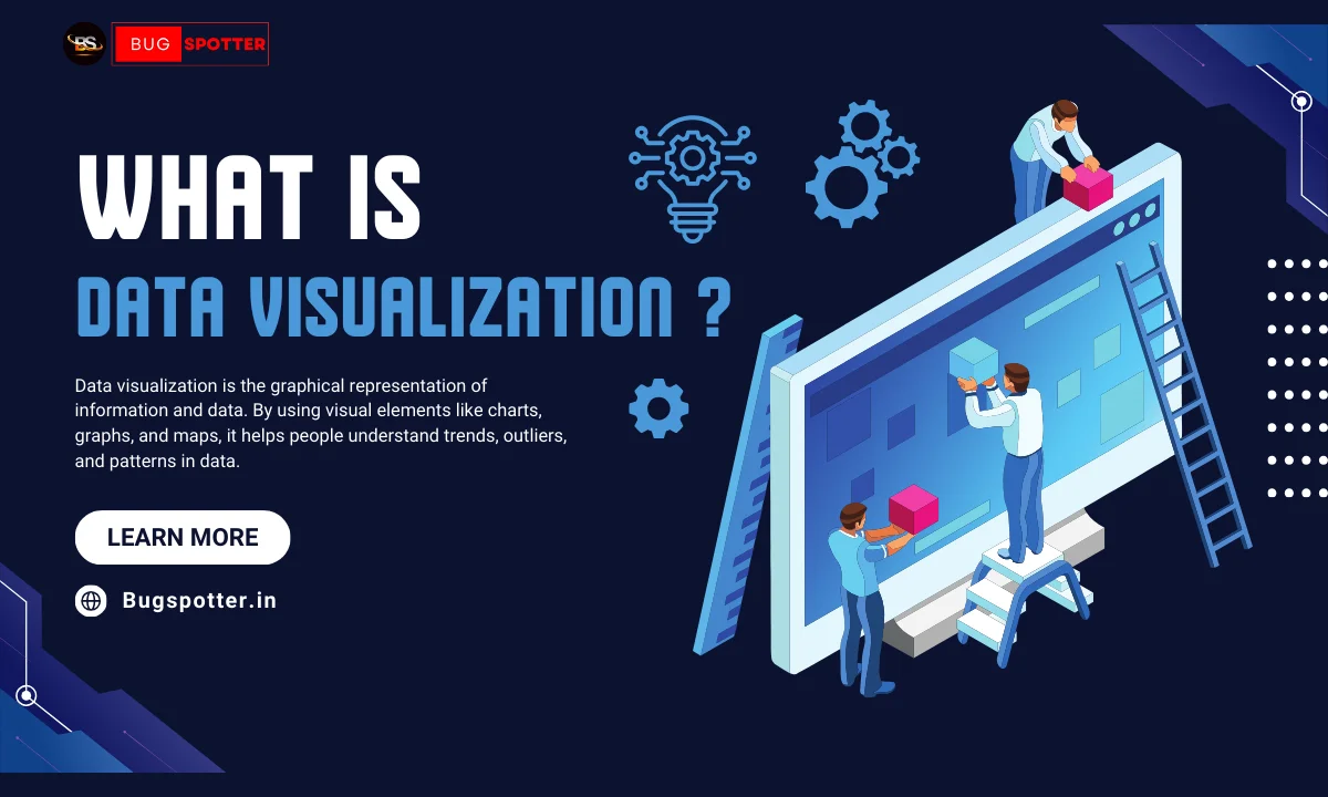
Data visualization is the graphical representation of information and data. By using visual elements like charts, graphs, and maps, it helps people understand trends, outliers, and patterns in data.
2. Why is data visualization important?
Data visualization is important because it makes complex data easier to understand, enables faster decision-making, highlights trends, and allows users to recognize patterns and insights that might not be obvious from raw data.
3. What are the most common types of data visualizations?
Some of the most common types of data visualizations include:
- Bar Charts
- Line Charts
- Pie Charts
- Scatter Plots
- Heatmaps
- Histograms
- Tree Maps
- Box Plots
4. How do I choose the right type of chart?
The right type of chart depends on the type of data you’re presenting:
- Bar charts for categorical comparisons.
- Line charts for trends over time.
- Pie charts for showing proportions of a whole.
- Scatter plots for relationships between two variables.
- Heatmaps for visualizing intensity or concentration of data in a matrix.
5. What is interactivity in data visualization?
Interactivity in data visualization allows users to engage with the data. They can zoom in, filter, or drill down for more detailed insights, providing a more in-depth understanding and allowing users to explore the data on their own.
6. What is data integrity in visualizations?
Data integrity refers to ensuring that the data is accurately represented in a visualization. It involves presenting data clearly and truthfully, avoiding misleading scales or incorrect chart types that could lead to wrong conclusions.
7. What is storytelling in data visualization?
Storytelling in data visualization involves organizing and presenting data in a way that highlights key insights and tells a clear, understandable narrative. It helps guide the audience through the data and provides context to make the findings more meaningful.
8. What tools are commonly used for data visualization?
Some popular tools for creating data visualizations include:
- Tableau
- Power BI
- Google Data Studio
- Excel/Google Sheets
- D3.js
- QlikView
- Plotly
9. How do you create an effective data visualization?
An effective data visualization:
- Presents the data clearly and accurately.
- Uses the appropriate type of chart or graph for the data.
- Avoids unnecessary clutter, focusing only on relevant information.
- Tells a compelling story with the data.
- Is simple, easy to understand, and visually appealing.
10. What are the challenges of data visualization?
Some challenges include:
- Choosing the right type of visualization.
- Avoiding misleading or distorted visuals.
- Ensuring data accuracy and integrity.
- Managing large and complex datasets.
- Making visualizations accessible to non-experts.
11. What is the difference between static and interactive visualizations?
- Static visualizations are fixed images (e.g., charts or infographics) that display data without any user interaction.
- Interactive visualizations allow users to engage with the data, filter, zoom, or explore further for deeper insights.
12. How can data visualization help businesses?
Data visualization helps businesses:
- Spot trends and patterns in data quickly.
- Make data-driven decisions.
- Identify issues or opportunities.
- Communicate complex insights to stakeholders and teams effectively.
Latest Posts
- All Posts
- Software Testing
- Uncategorized


Categories
- Artificial Intelligence (5)
- Best IT Training Institute Pune (9)
- Cloud (2)
- Data Analyst (55)
- Data Analyst Pro (15)
- data engineer (18)
- Data Science (104)
- Data Science Pro (20)
- Data Science Questions (6)
- Digital Marketing (4)
- Full Stack Development (7)
- Hiring News (41)
- HR (3)
- Jobs (3)
- News (1)
- Placements (2)
- SAM (4)
- Software Testing (70)
- Software Testing Pro (8)
- Uncategorized (33)
- Update (33)
Tags
- Artificial Intelligence (5)
- Best IT Training Institute Pune (9)
- Cloud (2)
- Data Analyst (55)
- Data Analyst Pro (15)
- data engineer (18)
- Data Science (104)
- Data Science Pro (20)
- Data Science Questions (6)
- Digital Marketing (4)
- Full Stack Development (7)
- Hiring News (41)
- HR (3)
- Jobs (3)
- News (1)
- Placements (2)
- SAM (4)
- Software Testing (70)
- Software Testing Pro (8)
- Uncategorized (33)
- Update (33)